Liquid Glass
Apple has always designed from first principles. Its most iconic shifts in interface design were never purely aesthetic. They were grounded in physics, material logic, and a careful reading of how users think, feel, and behave when interacting with a device.
This is what made Apple design feel inevitable. It was not just beautiful. It was believable.
With the launch of Liquid Glass in iOS 26, we are witnessing what appears to be the next evolution of Apple’s interface system. But it also brings with it a sense of conceptual dissonance that is difficult to ignore. While the direction may be strategic, the execution raises important questions about alignment, purpose, and whether the design system still reflects the same foundational thinking that defined Apple’s past.
Material metaphors to minimal surfaces
Apple’s relationship with design metaphors has always been closely tied to the capabilities of the platform it was building for.
When the first iPhone launched in 2007, it came with a deeply skeuomorphic design system. Notes looked like yellow legal pads with realistic paper texture and binding rings. Bookshelves resembled polished wood with visible grain patterns. The Voice Memos app featured a vintage microphone with chrome details and analog VU meters. This was not indulgence. It was intention. The iPhone was a completely new computing paradigm, and skeuomorphism acted as a bridge. It brought the familiarity of the physical world into a digital device that lacked buttons and tactile feedback. Users could tap a leather-bound address book because they understood what leather-bound books were for.
By 2013, the world had changed. Users were now native to smartphones. The screen had become the dominant interface surface in their daily lives. iOS 7 marked the first major aesthetic shift with the introduction of flat design. Gone were the stitched leather textures of the Find My Friends app and the rich drop shadows of the original Calculator. What remained was a clean, minimal interface focused on clarity, readability, and lightness. The new Control Center used simple circular buttons instead of realistic switches. The redesigned Weather app abandoned its detailed cloud animations for clean typography and gradient backgrounds.
While flat design was controversial at launch, especially within design circles that valued craft and complexity, it reflected a clear evolution. The device was flat. The interaction model was tap and swipe. The design system aligned with that reality. It also made interface creation more scalable and accessible for developers and designers across the world, contributing to the explosion of third-party apps in the years that followed.
A new material appears
Now, in 2025, Apple has introduced Liquid Glass in iOS 26. A visual system described as looking at content through a piece of refractive, fluid-like glass. Apple explains that this design language brings content closer to the user, that it creates depth and presence, and that it sets the tone for the spatial computing era led by VisionOS.
The direction appears strategic. Apple is beginning to unify its design language across touchscreens and headsets. Liquid Glass may be the visual handshake between iOS 26 and VisionOS, much like flat design was a reset for the modern smartphone era.
To fully understand where this sits in the broader arc of UI innovation, it is helpful to look back at other major design paradigm shifts and the first-principles thinking that shaped them. Whether it was the introduction of cards in webOS or the paper-like physics of Google’s Material Design, each shift came with a rationale deeply grounded in how users relate to screens, surfaces and space.
Here is a brief timeline of these pivotal UI evolutions:
| Year | Company | Paradigm shift | First-principles rationale |
|---|---|---|---|
| 2007 | Apple | iPhone skeuomorphism | Borrow textures, shadows and depth from real materials so multi-touch on smooth glass feels trustworthy and legible. |
| 2009 | Palm | webOS card stack | Represent multitasking as a deck of cards that you can shuffle and flick away, echoing the physical act of sorting documents. |
| 2010 | Microsoft | Windows Phone Metro | Use bold type, grids and motion inspired by transport signage to remove chrome and let content itself be the interface. |
| 2013 | Apple | iOS 7 flat design | Remove texture to honor the flat nature of the screen and rely on hierarchy, color and translucency for depth cues. |
| 2014 | Material Design | Treat UI surfaces like sheets of paper and ink with consistent shadows and physics-based motion to preserve a spatial model. | |
| 2021 | Material You | Derive theme color from user wallpaper so the device visually adapts to personal context, reinforcing ownership. | |
| 2024 | Material Expressive | Embrace a bolder, more emotional design aesthetic using contrast, depth, and tactile feedback to allow expressive storytelling within consistent system logic. | |
| 2025 | Apple | Liquid Glass | Attempt to merge touch and spatial computing through refractive surfaces that suggest presence, though its physical analogy remains contested. |
Looking at this evolution, what stands out is how clearly most shifts were anchored in the material truth of the medium. The best paradigms did not just change how software looked, but how it behaved and how it resonated with the user’s physical understanding of objects and motion.
Palm’s webOS cards succeeded because shuffling through apps felt exactly like shuffling through a deck of playing cards or documents on a desk. Google’s Material Design worked because paper and ink are materials we understand intuitively - we know how shadows fall, how surfaces layer, and how motion should feel when objects have weight and physics.
Liquid Glass, by contrast, seems to operate in more ambiguous territory.
Understanding the glass metaphor
Glass, in the physical world, is a material of separation. It is what you put between yourself and something else. When you look through a store window, the glass creates distance between you and the products inside. When you peer through a fishbowl, the curved glass distorts what you see. Museum display cases use glass specifically to prevent direct contact with artifacts. Even eyeglasses, which help us see clearly, work by correcting our vision rather than bringing objects physically closer.


This creates a fundamental tension with Apple’s stated goal for Liquid Glass. When Apple places interface elements behind a glassy refractive layer and claims this brings content closer, it contradicts our lived experience with glass as a material. The iPhone’s most powerful feature has always been direct manipulation - the sense that you are touching your photos, sliding your messages, and tapping your apps directly. There is no separation layer. There is no glass between you and your content, because the screen itself disappears during interaction.
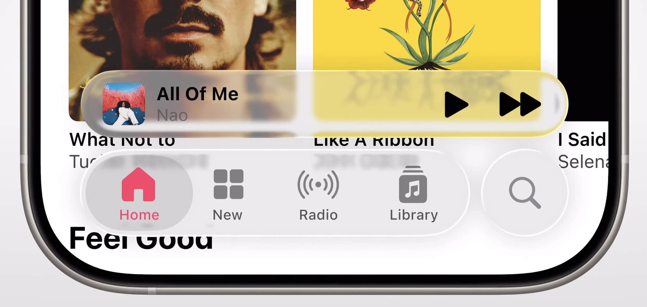
Consider how this plays out in practice. In the new Photos app, your images now appear to sit behind a subtle refractive surface that shifts and bends as you scroll. The effect is technically impressive, but it introduces a layer of visual processing between you and your memories. What was once immediate now feels mediated. What was once direct now feels filtered.
But the fundamental problem becomes even more pronounced with interactive controls. While Apple’s rationale for Liquid Glass centers on “seeing” content through a refractive surface, user interface controls are not meant to be seen—they are meant to be operated. When you tap a button, slide a slider, or toggle a switch, you are not observing these elements. You are manipulating them directly.
The physics of the glass metaphor completely breaks down here. In the physical world, you do not operate controls through glass. You do not adjust a thermostat through a window. You do not press elevator buttons through a display case. Controls require direct, unmediated contact to function properly, both physically and cognitively.

What emerges in iOS 26 are interface elements that no longer look or feel like controls at all. Buttons become amorphous shapes. Sliders lose their mechanical clarity. Toggle switches abandon their physical affordances. They appear as abstract forms floating behind glass—beautiful perhaps, but disconnected from the fundamental purpose of interface controls: to invite and respond to direct manipulation.
The confusion deepens with navigation elements like tab bars, which now appear as glassy blobs at the bottom of the screen. The physics here become completely incoherent. Are these tabs sitting on a surface beneath the glass, magnified and distorted by the refractive layer above? Are they made of glass themselves? When you tap to switch tabs, are you moving the glass to focus on a different element, or are you somehow reaching through the glass to touch the tab directly?
In the physical world, these questions would have obvious answers because glass and the objects behind it are distinct materials with clear spatial relationships. In Liquid Glass, the metaphor collapses under examination. The interface suggests properties that cannot exist simultaneously—glass that is both barrier and control, surface and depth, separation and integration.
Cross-platform design considerations
Much of the rationale seems to rest on Apple’s long-term ambitions for VisionOS. Interfaces will be projected into the real world. Users will view and interact with them through a headset. In that context, the idea of looking at things through glass is technically accurate. The user is, in fact, wearing lenses that sit between their eyes and the digital content.
However, the iPhone remains the most widely used computing device in the world. It is still the primary platform on which users interact with Apple software. And it is still a direct-touch surface that offers immediacy and clarity in every interaction.
When you tap the Messages app on your iPhone, your finger makes direct contact with the glass surface, and the app responds instantly. There is no additional layer, no simulation of looking through something else. The interaction model is fundamentally about eliminating barriers between intent and action. Liquid Glass introduces a visual barrier where none previously existed.
This suggests that design unity is being prioritized over interaction fidelity. That visual cohesion across Apple’s device ecosystem is being placed ahead of user expectation and physical logic on each individual platform.
System now demands more than it gives
The introduction of Liquid Glass also brings with it a significant cost for designers and developers working within Apple’s ecosystem.
Adopting the new aesthetic requires reworking existing visual hierarchies, layering models, contrast ratios, and tap target logic. The refractive effects mean that text and interface elements can appear differently depending on what sits behind them. Engineers need to handle the performance implications of real-time distortion effects, ensure accessibility for users with visual impairments, and maintain consistent rendering across different screen sizes and orientations.
For third-party app developers, this represents a substantial update cycle. Apps that looked polished and cohesive under the previous design system now appear outdated or visually inconsistent. Developers must invest time and resources to adapt their interfaces to work harmoniously with the new glass effects, often without clear guidelines about when and how to apply them appropriately.
Historically, Apple’s design changes asked a lot of developers, but they gave back more in clarity, consistency, and user benefit. The shift to flat design in iOS 7, while initially disruptive, ultimately made apps faster to build, easier to maintain, and more accessible to users with disabilities. The simplified visual language reduced cognitive load and improved usability across the platform.
Liquid Glass, by contrast, demands significant effort without clearly demonstrating what it improves in return. The visual effects are sophisticated, but they do not solve a clear user problem or unlock new capabilities that were previously impossible.
Interface design in context
This also reflects a larger concern about the trajectory of interface design in an era of artificial intelligence and ambient computing. While Apple has been focused on visual refinement and cross-platform aesthetic consistency, other companies have been rethinking the fundamental nature of interface itself.
Google’s latest AI-powered search results eliminate traditional blue links in favor of conversational responses. OpenAI’s ChatGPT has popularized text-based interaction that feels more like dialog than traditional software navigation. We’re headed into a future where voice and natural language might be more important than visual interface elements.
In this context, adding visual complexity to traditional touch interfaces feels like movement in the wrong direction. Rather than reducing friction between user intent and system response, Liquid Glass introduces an additional layer of visual processing that users must parse and understand.
The most forward-thinking interface design today focuses on invisibility - making the interaction so seamless that the interface itself disappears. Liquid Glass makes the interface more visible, more present, and more demanding of attention.
Timing and strategic direction
I do want to acknowledge this though: Perhaps Liquid Glass is not the end state, but a phase in transition. Perhaps it is the first visible step in a broader evolution toward a world where physical and digital blend more seamlessly. Perhaps Apple is laying down a visual foundation that will make more sense when more users are wearing their interfaces instead of holding and touching them.
We have to admit though, the technical execution of Liquid Glass is undeniably impressive. The buttery smooth transitions, the way they are able to bring out the true ‘liquidity’ is extremely commendable. Few others can pull this off in the industry. No doubts about that.
But for users today, on the devices they actually use, Liquid Glass feels like a solution in search of a problem. It adds visual sophistication without adding functional value. It creates aesthetic unity at the expense of interaction clarity.
This is not about resistance to change or nostalgia for previous design eras. Apple has always moved forward, and many of its most controversial design decisions have proven prescient over time. The elimination of the headphone jack, the introduction of the notch, the shift to USB-C - all of these changes initially generated criticism but ultimately reflected Apple’s ability to anticipate where technology was heading.
The difference with Liquid Glass is that it does not seem to anticipate a technological shift so much as accommodate a strategic one. The design change serves Apple’s goal of visual consistency across platforms rather than serving users’ goals of clarity, efficiency, and directness on the platform they actually use most.
Design integrity over visual spectacle
Apple has always designed from first principles. Dare I say, Liquid Glass signals a departure from that tradition? Prioritizing visual unity over interaction logic, future platforms over present reality. The metaphor doesn’t hold when examined against our physical understanding of glass as a material. The cost exceeds the benefit when measured against developer effort and user clarity. And in a moment when the rest of the industry is rethinking interface through intelligence and agency, Apple has chosen to spend time and resources on adding a layer of visual embellishment that makes us all wonder.
Don’t get me wrong though, I am not one to bring resistance to change. It’s about design integrity. The iPhone deserves interfaces that honor its directness, not ones that simulate the experience of wearing glasses you’re not actually wearing. The best Apple design has always felt inevitable because it respected the constraints and capabilities of its platform. Liquid Glass feels arbitrary because it imports constraints from a different platform entirely.
Apple will likely iterate and refine this direction over time. The company’s track record suggests that rough edges will be smoothed, performance will improve, and developers will adapt. But the fundamental question remains: does this change make computing more human, or does it make it more complex? Does it eliminate barriers between users and their content, or does it introduce new ones?
The answer may depend on whether you believe the future of computing is something you look through, or something you touch directly. For now, at least, most of us are still touching.